As the SMART program has grown across the world, many interpretations of the SMART logo have evolved. These happened organically simply because there has never been a single set of guidelines to support and steer the branding work of organisations, groups or individuals who wish to publicise their SMART Recovery work and programs within their local communities.
In recognising this, and in acknowledgement that our logo was designed 25 years ago, SMART Recovery International commissioned a designer to refresh the logo.
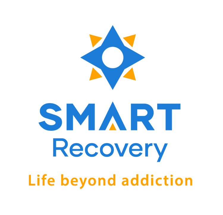
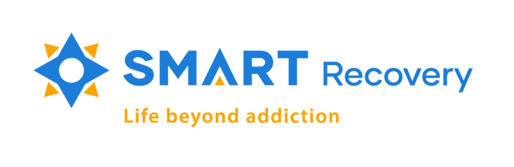
Our refreshed logo and font represent SMART as a progressive, modern organisation. The original compass points continue to represent the fundamental 4-Point Program. The points now move outward from an inner circle. This represents the person centeredness of SMART and alludes to how SMART provides the tools you need to move outward towards a new, balanced life. The fresh new colours represent stability and optimism.
We are all very proud of this collaborative effort to make sure our SMART brand is instantly recognisable no matter where in the world it is seen.
Please find the two versions of the new logo below.